Logo Lifespan - Evolution vs Revolution
Every important conversation with potential clients, 9/10 times, reflect a few specific themes. One of the most important topics hits on the concept of brand evolution versus brand revolution.
A brand is a living thing. As such, there are some implications:
It has a distinct personality
It can interrelate with people
It needs to be cared for to stay healthy
It can (and should) grow and change 👈
For the purpose of this entry, we’ll focus on the last implication.
“We don’t need a branding agency, we already have a logo we love!”
This misconception of not needing a branding agency, or any ongoing brand support, because you already love your logo is dangerous water to tread. Frankly, I want to completely dispel this idea with the understanding that your brand IS alive AND it’s much bigger and deeper than the logo.
Just as people are not defined solely by their outward appearance, brands are not just their pretty exterior (bad for Jason Momoa, good for me!).
Think of it this way: What haircut did you have at age 5? Age 17? Age 32? Did you have a goth phase? Are you still rocking that piercing you HAD to have?
For brands to thrive, they must accept that their logo – part of their outward appearance – might need to change, even if just incremently. Their brand must signal a response to challenges and opportunities in the world, just like people.
And, just like people, every brand does this differently.
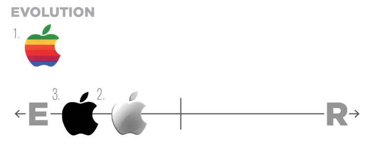
It’s not an exact science, but it is evolution verses revolution; a spectrum that every brand is on, and as the world changes, brands’ outward appearances adapt and respond accordingly.
We’ll use two well known examples to illustrate the paradigm.
Apple
Obviously a very consistent brand with a very strong sense of purpose.
Apple has evolved, albeit subtly, over time to capitalize on trends and opportunities. There was the original rainbow logo, then chrome, to the now black or white… you get the picture.
That’s Evolution.
Apple changed subtly over time as they matured as a brand and as trends came and went.
BP
In 2010, the Gulf of Mexico was covered in oil from a BP oil spill. This, along with heavy pressure from an increasingly environmentally conscious public, meant they needed to reposition themselves.
BP responded with wholesale change.
From an aggressive, almost militaristic, shield, to a peaceful, sunburst flower with “bp” as a scientific notation, BP signaled massive change. Save for the brand’s yellow and green, they aimed for a significant transformation.
That’s Revolution.
Your Brand Here
I repeat, your brand is alive.
We really hope you want it to grow, or at the very least, stay alive.
If so, you need to be constantly evaluating what the right answer is for your organization:
Where does our brand belong?


